
The Cartography of Capital: How Enhanced Entity Mapping Brings Clarity to Complex Wealth Structures
A design leadership perspective on portfolio visualization
Complex systems have always existed. What has not always existed is the design knowledge and technology to visualize them properly. This is as true of a city's transit network as it is of a semiconductor architecture, a genome, or the multi-entity ownership structure of a large family office. For decades, the default representations have been flat: spreadsheets, static org charts, footnoted PDF reports. The data was always there, but the structure was not visible.
This is a foundational problem in information design. It is not new. Charles and Ray Eames wrestled with it. Edward Tufte built a career on it. Harry Beck solved a version of it in 1931 with a single diagram. What is new is its application to private wealth: the challenge of rendering multi-layered entity hierarchies, ownership flows, and investment positions in a way humans can actually comprehend at a glance.
This article examines that challenge, the design principles that inform our approach to it, and what we have learned building the Enhanced Entity Map at Unlimited.ai.
The Invisible Architecture of Wealth
A typical ultra-high-net-worth family’s wealth does not sit in a single account. It flows through holding companies, trusts, LLCs in Wyoming, Delaware, or the Cayman Islands, managed accounts at several custodians, direct investments, real estate vehicles, and charitable pledges. Each exists for a reason: tax efficiency, liability protection, estate planning, or generational transfer. Yet, together they form a structure no single document can adequately describe.
Traditional industry tools treat this structure as a list. Quarterly PDF reports enumerate entities. Excel-based balance sheets tally balances. Static org charts from estate attorneys footnote ownership percentages. But relationships, the connective tissue that defines how capital actually moves from a consolidated portfolio through an LLC, into a managed account, and down into individual investment positions, remain invisible.
Enhanced Entity Mapping was designed specifically to address this invisibility and illuminate these relationships. By providing a visual and interactive representation of complex entity structures, Enhanced Entity Mapping gives principals immediate clarity, reducing confusion and empowering more confident decision-making.

Charles and Ray Eames
Lessons from the Masters: Why Visualization of Complexity Matters
To understand why this matters, it helps to step outside of finance entirely and into the history of information design.
Charles Eames was an architect, designer, and filmmaker whose influence on twentieth-century visual culture is difficult to overstate. He once observed: “Eventually everything connects: people, ideas, objects. The quality of the connections is the key to quality per se.” Eames was not talking about wealth structures. He was describing complex systems themselves. Yet his insight applies directly. In a family office portfolio, the connections between entities are not secondary information. They are the information. An LLC is meaningless without understanding what it holds, who owns it, and how capital flows through it. A managed account is just a number until you can trace it back through the entity hierarchy to the consolidated portfolio it belongs to.
Eames and his wife, Ray, demonstrated this principle most powerfully in their 1977 film Powers of Ten which visualized the relative scale of the universe by zooming from a picnic blanket in Chicago to the farthest observable galaxies, then back down into the subatomic structure of a carbon atom. The film did not simplify the universe, rather, made complexity navigable by allowing the viewer to move through layers of scale with an intuitive, continuous visual logic. The lesson for any designer working with complex data is profound: the goal is not to reduce complexity but to make it traversable.
Edward Tufte, the Yale statistician and information design theorist whom The New York Times once called “the Leonardo da Vinci of Data,” built an entire body of work on this principle. In Envisioning Information, he wrote that “clutter and confusion are failures of design, not attributes of information.” Tufte argued relentlessly that the answer to overwhelming complexity is not simplification, which often means hiding crucial data, but clarity. His formulation is worth internalizing: “What is to be sought in designs for the display of information is the clear portrayal of complexity. Not the complication of the simple; rather, the task of the designer is to give visual access to the subtle and the difficult, that is, revelation of the complex.”
With these design principles in mind, it becomes clear that any serious attempt at entity mapping in wealth management must be measured against this rigorous standard of clarity.
The Subway Map Precedent
There is perhaps no more instructive historical analogy for what Enhanced Entity Mapping aspires to do than Harry Beck’s 1931 redesign of the London Underground map.
Before Beck, the Tube map was a geographical document. Lines were drawn over street maps, following the actual paths of the tunnels beneath London. The result was a tangle of curves that was geographically accurate but practically useless. Stations in central London were crammed so tightly together they became illegible, while outer stations were spread so far apart they seemed unreachable. The map was true, but it was not useful.
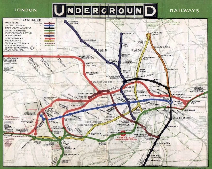
First published Underground map, 1908
Beck was trained as an electrical draughtsman. He had a radical insight. Passengers riding the Underground do not care about geographical accuracy. They care about connections: how to get from one station to another and where to change lines. Beck reimagined the map as a schematic diagram. He used only horizontal, vertical, and forty-five-degree lines, with stations equally spaced. The result was a design so clear and legible that, when first printed in 1933, 700,000 copies were distributed and a reprint was needed within a month. More than ninety years later, every major transit system in the world uses Beck’s topological approach.
The parallel to entity mapping in wealth management is direct. A family’s wealth structure is a network: a series of nodes (entities, accounts, investments) connected by ownership relationships. Displaying this network as a flat list, sorted alphabetically or by account number, is equivalent to the pre-Beck Tube map. It is accurate, but it fails the user.
What is needed is a topological view, one that privileges connections and flows over raw listing.
This is the design philosophy behind our Enhanced Entity Map. When a user opens their Consolidated Portfolio and selects the Mapping view, they see their entire wealth structure rendered as an interactive graph. Entities branch from the consolidated root. Investments flow outward like colored lines on a transit diagram. Connecting lines display ownership percentages. The path of capital is traceable at a glance.
Designing for How People Actually Think
The design decisions embedded in the Enhanced Entity Map are deliberate and research-informed.
Color as a semantic signal- Different entity types, whether LLCs, managed accounts, or direct holdings, are distinguished by color. This follows the same principle Beck used to differentiate Tube lines. Color is not decorative here; it is informational. It allows the eye to trace a single ownership path through a complex hierarchy without conscious effort, as a commuter’s eye follows a single colored line from one end of a transit map to the other.
Progressive disclosure through interaction - The map begins at the highest level of abstraction: the Consolidated Portfolio, its NAV, and its child entities. Toggling “Show Investments” reveals the next layer, with every individual investment position branching from its parent entity. Click any node, and its ownership path illuminates. This is the Eamesian Powers of Ten principle applied to wealth. The user controls the zoom, moving from macro to micro without ever losing context.
Topology over taxonomy - Investments are not arranged by asset class or alphabetically. They are arranged by relationship, grouped under the entity that holds them, connected by the ownership chain that defines how capital arrived there. This is the Beck insight applied to finance: the organizing principle is the network itself, not some external classification system imposed upon it.
The contextual menu as a design commitment - Every node includes a contextual menu that lets the user view, edit, or manage that entity directly. This is not a minor UI detail. It is a philosophical commitment to the idea that visualization should not be a passive experience. The map is an interface to your wealth.
What Users Actually Say
The most meaningful validation of any design is not from theory but from users. The reactions we hear from principals, family office executives, and advisors seeing the Enhanced Entity Map for the first time are consistent. They are also remarkably emotional.
“I’ve never seen my portfolio this clear before.”
This is the most common response and worth pausing on. These are people who receive quarterly reports. They have spreadsheets. They have attorneys and CPAs who explain the structure to them. And yet they have never seen it, because seeing requires a visual form that matches the structure’s actual topology.
“I didn’t really understand that was how my portfolio was structured until I saw it.”
This response is even more telling. It suggests that for many principals, the entity structure they approved, often years ago, often across multiple advisory relationships, has become abstract. They know they have a trust. They know they have an LLC. But how those entities connect, how ownership percentages cascade, how a dollar moves from their consolidated portfolio down to a specific investment position: that was opaque.

Topological map of Mount Rainier National Park
The Competitive Landscape: Taxonomy vs. Topology
We are not entirely alone in attempting to solve this problem. Other platforms in the wealth management technology space have introduced their own versions of entity or wealth mapping. These efforts are well-intentioned, and some of them are useful. But they tend to share a common design limitation: they are taxonomic rather than topological.
A taxonomic map organizes entities into categories (Financial, Real Estate, Loans) and then lists the items within each category in a hierarchical tree. This is essentially a file-folder metaphor applied to wealth. It tells you what you have and where it sits in a classification system. But it does not show you how things connect: how ownership flows, how capital moves, how a single investment position relates to the entity that holds it and the consolidated portfolio above.
A topological map, by contrast, is organized by relationships. It shows the network as a graph. When you toggle investments on, you do not see a list. You see a living diagram of flows, with colored lines tracing routes from origin to destination.
The distinction matters because the questions principals and advisors actually ask are topological. “How does money get from my trust to that fund?” “What’s the ownership chain on this property?” “If I restructure this LLC, what upstreams positions are affected?”
The Deeper Principle: Clarity as Fiduciary Responsibility
There is a deeper argument to be made here, one that extends beyond design aesthetics and into the realm of fiduciary duty.
When a wealth structure is opaque to the people who own it, when principals cannot trace how their capital flows through their own entities, the risk of misunderstanding, misallocation, and missed opportunity increases. Estate plans go unreviewed because the structure is too complex to hold in one’s head. Tax inefficiencies persist because no one can see the full picture. Generational transitions stall because the next generation cannot comprehend what they are inheriting.
In an era when family offices are managing increasingly complex portfolios spanning public and private markets, crossing multiple jurisdictions, and layered with entity structures reflecting decades of estate planning, the ability to see the whole picture, interactively and in real time, is arguably a fiduciary imperative.
Tufte wrote that “graphical excellence consists of complex ideas communicated with clarity, precision, and efficiency.” Charles Eames said that “design is a plan for arranging elements in such a way as best to accomplish a particular purpose.” Harry Beck showed that a transit system becomes navigable not when you draw it accurately, but when you draw it clearly.
The Enhanced Entity Map applies these principles to one of the most complex visualization challenges in modern finance.
This post reflects the design philosophy of the Unlimited.ai platform. To see the Enhanced Entity Map in action, reach out to our team with the button below.